Union Pacific: Enterprise Website Redesign & Migration
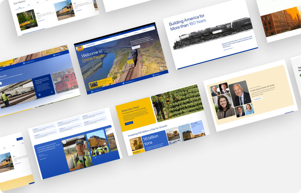
Screen of the Final Landing Page Design – Releasing June 10
Role: Senior UX Designer
Timeline: Nov 2024 – Present
Leading the multi-year redesign and phased migration of Union Pacific’s public-facing website (up.com), spanning 4,000+ pages and complex stakeholder requirements. The goal: modernize user experience, establish scalable UX standards, improve accessibility and SEO, and transition content to Adobe Experience Manager (AEM).
Responsibilities:
- UX Strategy: Defined UX approach, site-wide IA, and navigation models based on user research and stakeholder input.
Design Systems & Governance: Established component standards, design guidelines, and governance workflows for long-term quality control.
Content Architecture & SEO: Led content mapping, IA restructuring, and SEO optimization to improve findability and accessibility.
Component QA: Audited and reviewed components delivered by Globant to ensure alignment with UX/UI standards.
Analytics & Measurement: Developed behavioral analytics framework using Quantum Metrics to track user engagement and inform design iterations.
Stakeholder Collaboration: Partnered with internal stakeholders (content, marketing, IT), engineering teams, and Globant to align project goals and ensure cohesive implementation.
Highlights:
Migrating 4,000+ pages into AEM with improved IA, navigation, and accessibility.
Conducted card sorting, tree testing, and behavioral analytics to validate and refine site architecture.
Built UX governance processes adopted across teams to maintain design consistency.
Drove SEO and accessibility improvements across migrated pages.
Established tracking and measurement framework for ongoing UX improvements.
Impact & Recognition
A few highlights:
Stakeholder Feedback
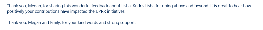
“Kudos Lisha for going above and beyond. It is great to hear how positively your contributions have impacted the UPRR initiatives.”
— Program Leadership
“Lisha has been a huge asset to the redesign project and UX team. Her Figma design skills are top notch, allowing her to design on the fly so teams can see their new pages take shape. This has saved considerable time and created good will with key stakeholders.”
— Senior Manager, UP.com
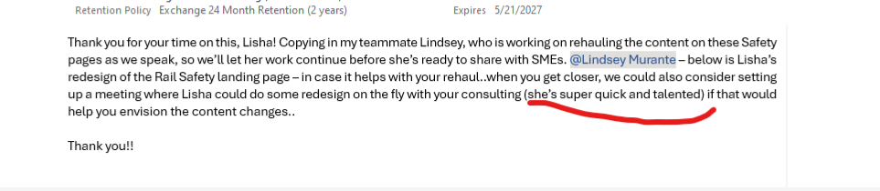
“She’s super quick and talented — her consulting is helping teams envision content changes more effectively.”
— Business Stakeholder
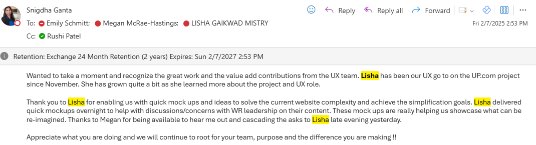
“Lisha has been our UX go-to on the UP.com project since November. She delivered quick mockups overnight to help leadership discussions and is helping us simplify complex website flows.”
— General Director, Enterprise Systems
“Lisha really has been doing a fantastic job. I’ve shared feedback with leadership as well.”
— Senior Manager, UX
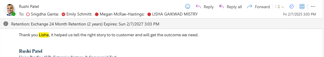
“It helped us tell the right story to the customer and will get the outcome we need.”
— AVP, Enterprise Systems & Commercial Tech
Throughout the project, my work in UX governance, component QA, and content hierarchy was repeatedly recognized by internal leadership. I was frequently asked to lead reviews, advise on SEO strategy, and help validate external contractor work.
Trusted Roles & Impact Areas
- Lead UX consultant validating external contractor (Globant) work
- Regularly invited to lead governance discussions across UX, Marketing, and IT
- Key contributor to SEO hierarchy improvements and content clarity
- Known for rapid, high-quality Figma prototyping that accelerated team workflows
- Helped stakeholders visualize and simplify legacy content during migration

What redesigning a 10,000+ page legacy enterprise site taught me about UX maturity
1. The Cost of Skipping Content Strategy
During the UP.com migration, content strategy was under-resourced. Migration scripts were prioritized, but content rewriting became a back-burner task, happening after design and build phases. As a result, many auto-migrated pages ended up less usable than their older versions.
Lesson:
Enterprise redesigns need dedicated content leadership upfront. Design-led content looks polished but often lacks clarity and usability. Embedding content strategy earlier would have saved time, rework, and improved overall UX.
2. The Governance Gap
Several site changes and feature requests bypassed UX validation going from stakeholder approval straight to development and contractor execution. Often, UX was asked to “review after the fact,” revealing usability issues that were harder to correct once paid for and built.
Lesson:
Strong UX governance isn’t about gatekeeping it’s about creating a clear, collaborative pipeline where UX pre-validates changes. Embedding this process earlier reduces technical debt and elevates quality.
3. Automation ≠ Instant UX Wins
Auto-migration scripts processed 10,000+ legacy pages using a limited template set. While efficient at scale, this introduced design regressions on many pages. broken layouts, mismatched hierarchy, and inconsistent styling.
Lesson:
Automation is a tool, not a solution. UX review and QA are critical even in automated workflows. Migrating “as is” without thoughtful UX oversight can degrade user experience, even when technical migration succeeds.